Genie Map
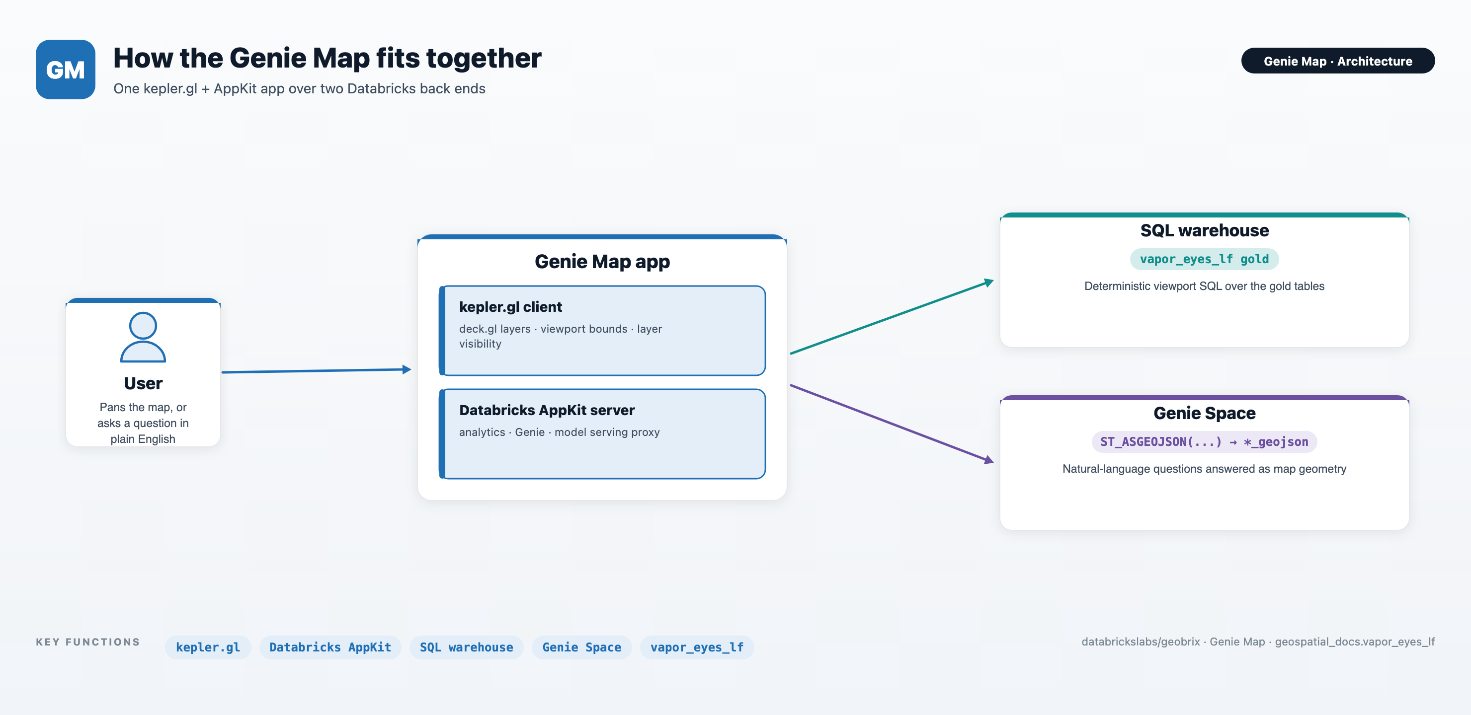
Genie Map is a Databricks App that turns the GeoBrix-processed Permian methane gold data
into an interactive map. It sits on top of the
Vapor-Eyes methane pipeline: where that pipeline detects and
attributes methane over the Permian Basin, Genie Map is where you go to look at the
result and interrogate it. The client is React + kepler.gl; the
server is Databricks AppKit;
the data is the geospatial_docs.vapor_eyes_lf gold schema.
Genie Map grew out of the AI-powered map-agent demo from the Data + AI Summit 2026 session Scaling Geospatial Analytics at S&P Global Energy: From Billions of Points to AI-Powered Map Agents with Databricks, presented by Hubert Boguski (S&P Global) and Michael Johns (Databricks).
▶ Watch the session on databricks.com.
apps/genie_map — the React + kepler.gl client, the AppKit server, and full setup instructions live here. See its README for the quickstart — prerequisites, environment setup, and the local-dev and deploy commands — and docs/BUILD.md for the full build narrative if you want to rebuild it or adapt it to another dataset.
Two ways to explore
Genie Map answers the same data two ways, side by side.
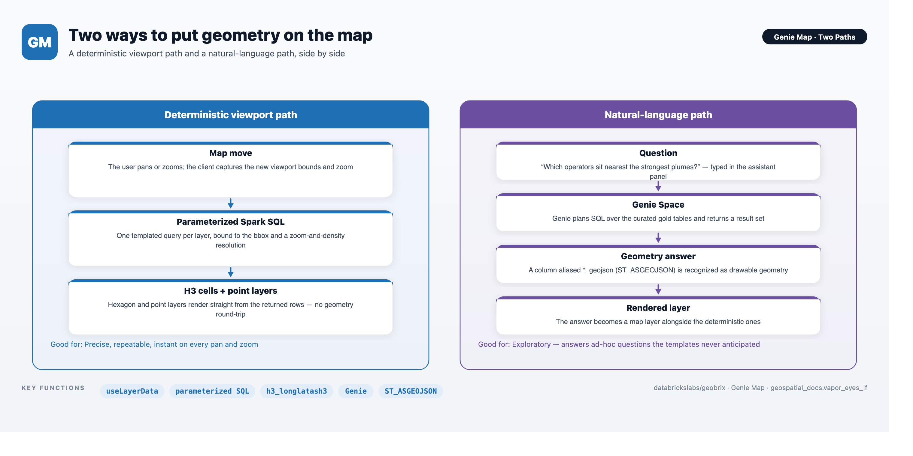
Move the map. Every pan and zoom runs parameterized Spark SQL for the current viewport and redraws the layers. This path is deterministic: the same view always yields the same query and the same hexagons and points. Four layers ship:
| Layer | Shape | What it shows |
|---|---|---|
| CH₄ hotspots | H3 hexagons | Peak methane concentration per cell |
| Well density | H3 hexagons | How many wells fall in each cell |
| Wells | Points | Individual wells, with operator and play |
| EMIT plumes | Points | Detected plumes, by peak concentration |
Ask a question. Type a natural-language question in the AI Assistant panel — for example, "which operators have wells near the strongest plumes?" The panel routes the question to a curated Genie Space, and the shape of the answer decides how it lands on the canvas. There are two kinds of result, and it helps to ask with the one you want in mind.
Two kinds of question result
| You want… | Ask for… | What the result must contain | What you get |
|---|---|---|---|
| A new map layer | "Show / map / plot …" — e.g. "Show the latest plumes, strongest first" | one ST_ASGEOJSON(...) geometry column (aliased *_geojson) | Genie's answer is drawn as a new layer beside the others |
| An interactive chart that filters the map | "Chart … and let me filter the map" — e.g. "Chart plume concentration and let me filter the map" | one row per feature, carrying both a *_geojson geometry and chartable attributes (a number like max_conc_ppmm, plus categoricals like lead_operator) | a chart whose selection highlights the matching features on the map, and vice-versa |
The distinction is the row grain. A map-layer answer just needs geometry. The interactive chart needs geometry and per-feature attributes on the same rows — because the chart and the map layer are the same dataset, and selecting chart elements cross-filters the layer by row. A pre-aggregated rollup (one row per operator, per county, per H3 cell) still charts fine, but with no per-feature geometry it can't cross-filter the map — so when you want that interactivity, ask for the individual features, not the summary.
The charts plot numeric values (a histogram or box plot of a measure like
max_conc_ppmm), so ask for a number to chart. To slice by a category such as operator,
chart the number and add a kepler.gl filter on the category column — that filter drives
the map too. (Asking to chart a category directly on an axis — "concentration by
operator" as a scatter — doesn't produce a usable chart, since operator isn't numeric.)
Either way, a spoken question and a drawn map answer share one canvas.
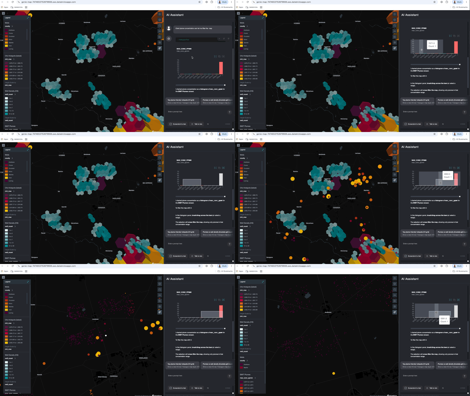
Above: the interactive-chart path. The user asks "Chart plume concentration and let me filter the map"; brushing a range on the resulting histogram filters the plume layer on the map to just that concentration band — the chart and map are the same dataset, so a selection in one cross-filters the other.
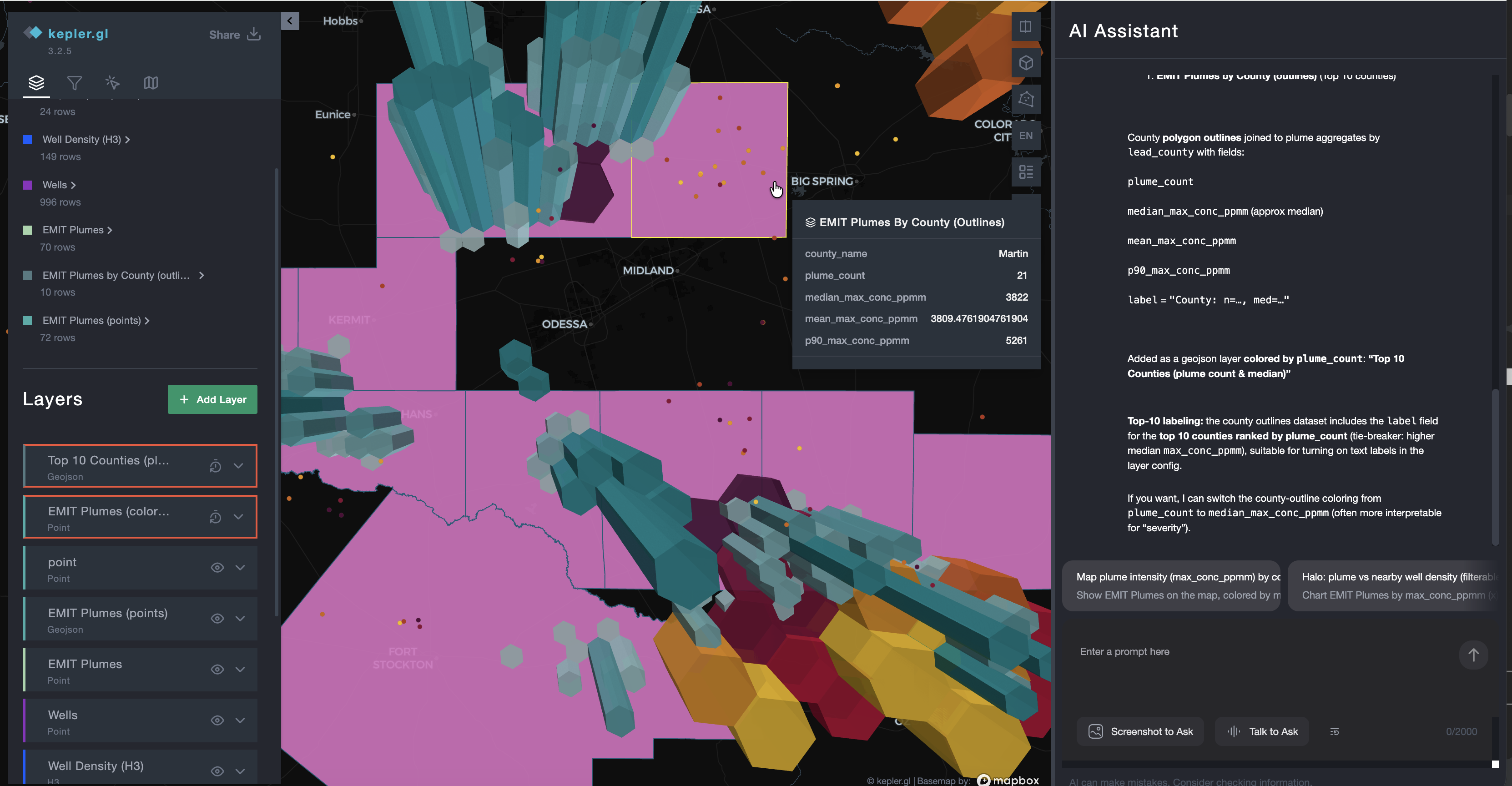
Above: the "new map layer" path in action. The user asked the assistant to map EMIT plumes
by county; it joined the county polygons to plume aggregates by lead_county, added the
result as a geojson layer colored by plume_count, and left the CH₄ hotspot and well
layers in place — a natural-language question and its drawn answer on one canvas.
Density-aware dynamic H3
The map's standout behavior is how its hexagon layers pick their resolution. Keying resolution to zoom alone misbehaves on real data — a handful of hexagons blown up to a continental scale tells you nothing. So Genie Map chooses resolution from both zoom and data density.
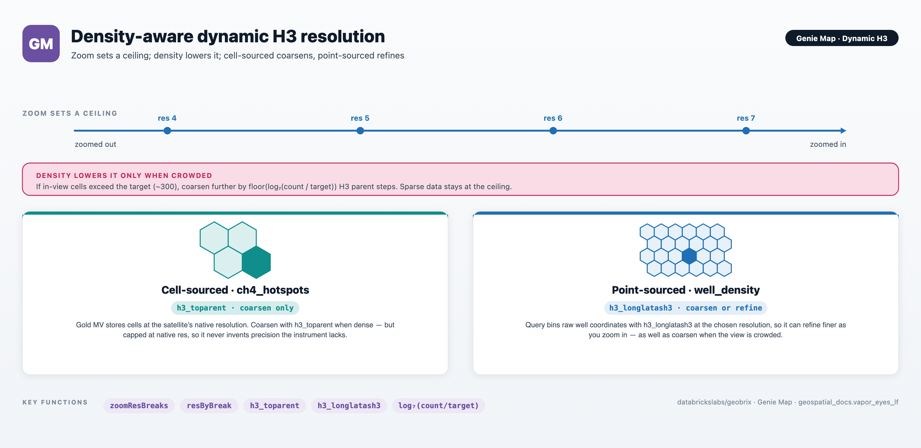
- Zoom sets a ceiling — the maximum resolution allowed at the current zoom.
- Density lowers it only when crowded — when a view holds far more cells than the map can usefully show, the hexagons coarsen a step at a time. Sparse views stay at the ceiling, with no pointless coarsening.
The two hexagon layers differ in how far they can go. The CH₄ hotspots come from cells stored at the satellite's native resolution, so they coarsen when dense but never go finer than the instrument measured. The well-density layer bins raw well coordinates on the fly, so it can both coarsen when crowded and refine as you zoom in. The result reads naturally end to end: a basin-wide screen of coarse hexagons that resolves into fine cells and individual well pads as you close in.
One map-ready wells view
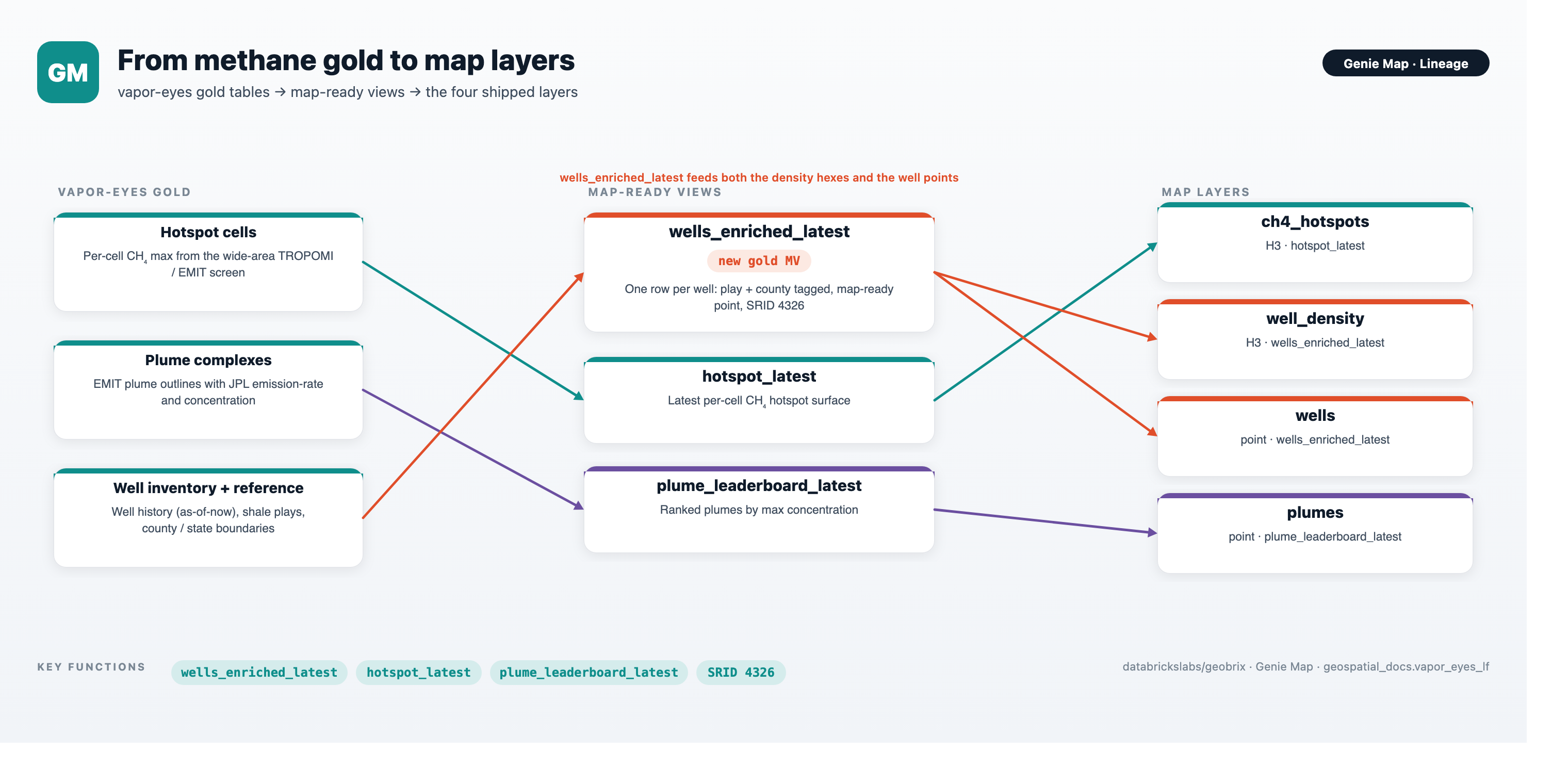
Both the well-density hexagons and the individual well points read one gold view,
wells_enriched_latest. It takes the current well inventory and spatially tags each well
with its shale play and its county and state, carrying the operator, lease, field, and a
map-ready point — one row per well.
Built to be re-pointed
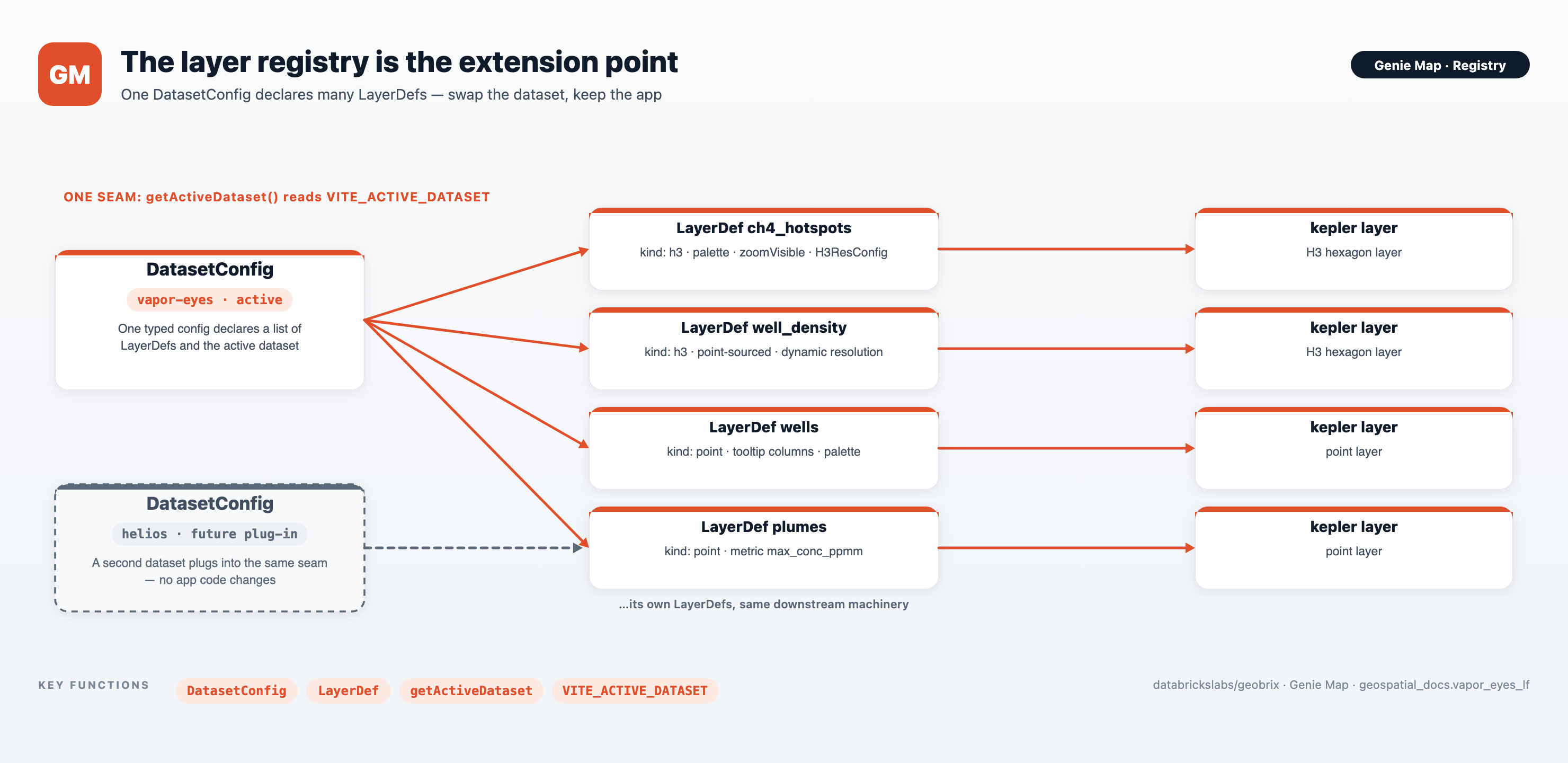
Genie Map is config-driven. One dataset configuration declares the list of layers, and everything downstream — the SQL each layer runs, the kepler layer it draws, when it is visible — is derived from that one declaration. Pointing the map at a different scenario is a matter of adding a configuration, not editing app code.